

Brand guidelines
The Praktikal brandbook
Everything needed to represent Praktikal correctly — the logo and the files to use it, the colours and type it is built from, and how we write about what we do. Written for partners, media, and anyone building something with our name on it.
Something you need that is not here? info@praktikal.ee
The logo
The primary lockup is the wordmark with the pointing hand. Use it wherever there is room; drop to the mark only where the wordmark would be too small to read.

Primary lockup
The wordmark with the pointing hand. This is the Praktikal logo; use it unless there is a reason not to.


Primary lockup, reversed
The same lockup with the wordmark in paper, for dark surfaces. The green does not change between the two.


Mark
The P and hand alone. For square placements, avatars, and favicons, where the wordmark would be illegible.


Wordmark, monochrome
The word alone, without the hand, in ink. For single-colour printing and contexts that cannot carry the green.


P monogram, monochrome
The letter alone, without the hand. The most reduced form, for very small single-colour placements.

Clearspace
Keep free space on every side of the logo equal to the height of the P. Nothing — type, images, edges, other logos — enters it.
Minimum size
The lockup stays legible down to 120px wide on screen and 30mm in print. Below that, use the mark instead.
Background
Place the logo on Paper or another light, even surface. Contrast behind the wordmark must stay high enough to read the ink.
Clearspace
The shaded band is the height of the P, repeated on every side. Nothing enters it — not type, not an image edge, not another logo.
Minimum size
Shown at 120px, the smallest the lockup may be drawn on screen. Below this, use the mark instead.
What not to do
These are the things that actually go wrong. If a placement needs something this document does not cover, ask us rather than improvising.
Correct
The supplied artwork, unaltered
Green on a light, even surface, scaled proportionally. Every panel below breaks this one.
Wrong
Do not recolour it
The green is fixed. A logo you have seen in another colour was the product showing which account is signed in. Those tints are interface state, not brand colours, and not yours to use.
Wrong
Do not place it on a dark or busy background
The wordmark is ink and will disappear. Use the reversed lockup on dark surfaces, and keep any photograph behind it dark and quiet enough to read.
Wrong
Do not stretch or rotate it
Scale proportionally, always.
Praktikal
Wrong
Do not rebuild the lockup
Do not set the word in another typeface, respace it, or move the hand. Use the supplied file.
Wrong
Do not add effects
No shadows, outlines, gradients, or containers the supplied file does not have.
Colour
Core
Two greens, with different jobs. Praktikal Green is the primary: it carries every primary action in the product and every call to action on the site. The accent is the brighter green the logo and the marker highlights are drawn in. Ink is the text and outline colour that both greens sit against.
Praktikal Green
- HEX
- #008243
- RGB
- 0 130 67
- CMYK
- 100 0 48 49
The primary. Every primary button, in the product and on this site. Deep enough to carry white text, which is the whole reason it and not the accent does this job.
Accent green
- HEX
- #77c043
- RGB
- 119 192 67
- CMYK
- 38 0 65 25
The logo is drawn in it, and so are marker highlights and small accents. It is a fill behind ink, never a background for white text — see the pairings below.
Ink
- HEX
- #414042
- RGB
- 65 64 66
- CMYK
- 2 3 0 74
Body text, headings, and the dark outline on cards and buttons. Also the full-bleed dark band on the public site.
Paper
- HEX
- #fafafa
- RGB
- 250 250 250
- CMYK
- 0 0 0 2
The base surface behind everything. Not pure white.
Supporting
Used to separate sections and to signal meaning inside the product. They support green; they never replace it.
Blue
- HEX
- #24a8de
- RGB
- 36 168 222
- CMYK
- 84 24 0 13
Section and surface accent, anywhere in the product. Informational states.
Orange
- HEX
- #ea780e
- RGB
- 234 120 14
- CMYK
- 0 49 94 8
Section accent. Warning states in the product.
Magenta
- HEX
- #e85d9c
- RGB
- 232 93 156
- CMYK
- 0 60 33 9
Section and surface accent, anywhere in the product. Decorative only.
Red
- HEX
- #e00000
- RGB
- 224 0 0
- CMYK
- 0 100 100 12
Destructive and error states only. Never decorative.
Neutrals
Borders, secondary text, and surfaces. There is a fuller ramp behind these; the steps below are the ones that carry brand meaning.
Secondary text
- HEX
- #757575
- RGB
- 117 117 117
- CMYK
- 0 0 0 54
Supporting copy, footer links, captions. Build against this token, not against the product's `--color-text-secondary` alias, which currently resolves a step lighter and does not hold its contrast on Paper.
Divider
- HEX
- #e0e0e0
- RGB
- 224 224 224
- CMYK
- 0 0 0 12
Rules between rows and sections, and the edge of a panel against the surface it sits on. It separates; it does not enclose.
Field border
- HEX
- #c2c2c2
- RGB
- 194 194 194
- CMYK
- 0 0 0 24
The box around anything you type or choose in — text inputs, selects, textareas. Deliberately lighter than a control outline, so a form does not read as a row of buttons. Controls take Ink instead.
Surface
- HEX
- #f5f5f5
- RGB
- 245 245 245
- CMYK
- 0 0 0 4
Raised and inset surfaces against Paper.
Which pairs to use
A colour is only usable against another one. These are the combinations we approve, with the contrast each achieves.
Ink on paper
9.9:1Passes AA
The default. Every long passage of text on our surfaces is this pair.
Ink on accent green
4.6:1Passes AA
The correct way to use the accent behind type: a highlight, a marker bar, a small filled panel.
Paper on accent green
2.1:1 Fails AA
Do not use. The accent is too light to carry white text, which is why the primary is a different green.
Paper on Praktikal Green
4.7:1Passes AA
The primary button. Use this pair wherever you need white text on green.
Paper on ink
9.9:1Passes AA
The dark band. Green stays an accent on it, never the text colour.
Ratios are measured against WCAG 2.1 AA for body text (4.5:1), and computed from the same values the swatches above publish.
CMYK is a plain arithmetic conversion from the RGB value, with no colour profile behind it. For anything going to press, ask us for a profiled value rather than converting these yourself.
Building an interface with these colours? The design reference gives the token behind each one.
Typography
Praktikal
Montserrat
Display and headings, across the product and the public site. Set tight, with negative tracking at large sizes.
Regular 400, Medium 500, SemiBold 600, Bold 700 · Google Fonts, SIL Open Font License
Praktikal
Nunito Sans
Body copy on the public site only. The product app sets Montserrat throughout.
Regular 400, SemiBold 600 · Google Fonts, SIL Open Font License
Display large
56 px Page titles and the opening statement.
Display medium
40 px Section headings.
Heading 1
28 px The main heading on a screen inside the product.
Heading 2
24 px Subsection headings.
Heading 3
20 px Panel and dialog titles. A card in a dense grid takes a step or two below this — the title competes with its neighbours, not with the page.
Heading 4
16 px The smallest heading, and long-form reading text.
Body
14 px Prose, form fields, and anything read a paragraph at a time. Card titles sit here too.
Small
12 px The working size of the product, not an exception to it: list rows, table cells, chips, metadata and helper text. A dense surface is set here throughout rather than shrinking one label at a time.
Extra small
10 px Uppercase section labels and counters. The floor — nothing is set smaller, and nothing at this size carries meaning on its own.
Imagery
Our pictures are real classrooms doing real work. You cannot license our library, so this is the brief we would give a photographer — and the one to give yours.
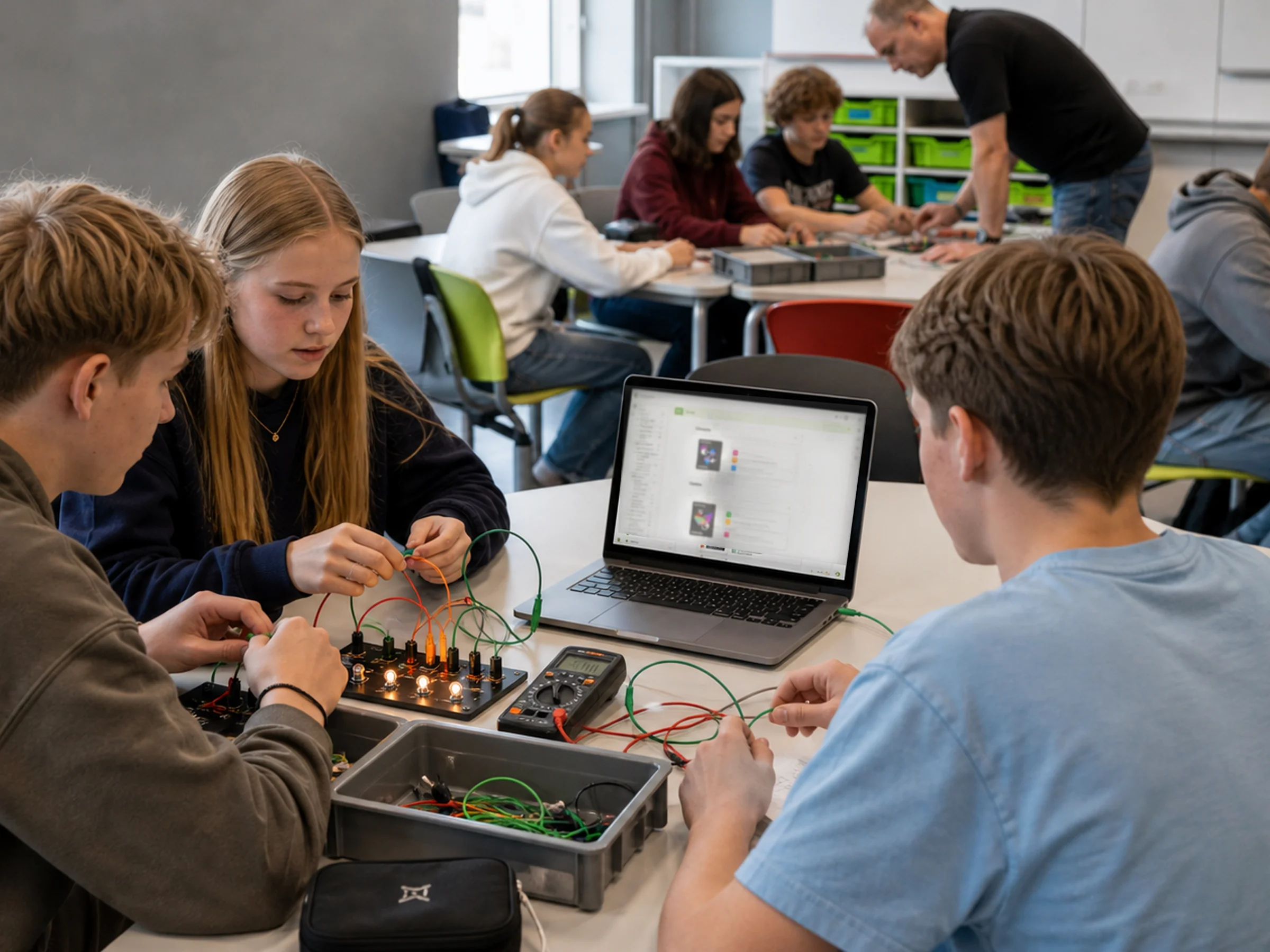
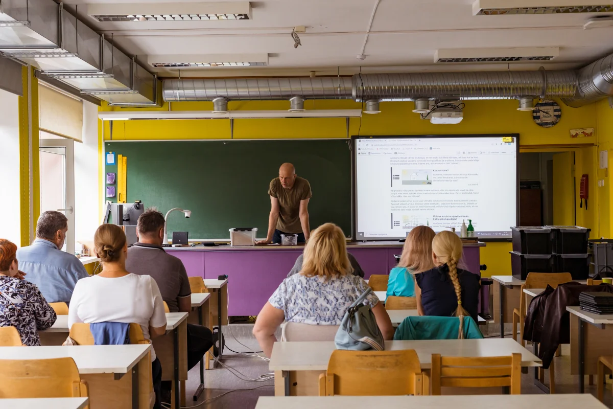

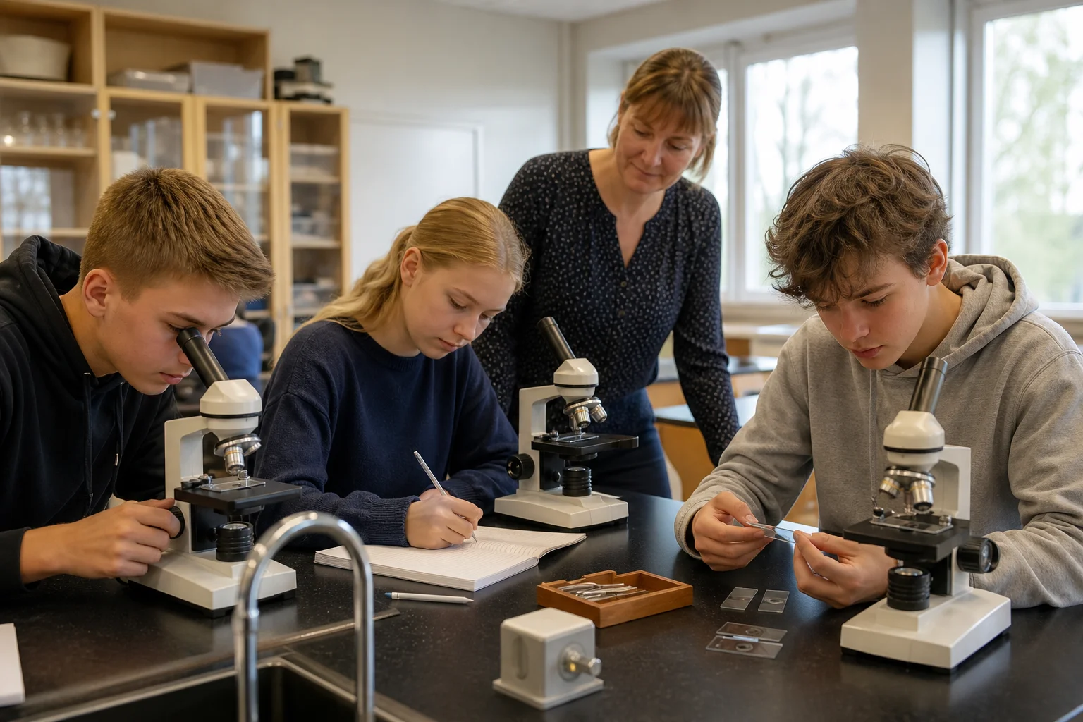
Real classrooms, real equipment
Nordic and Estonian schools as they actually look — ordinary rooms, worn benches, the equipment a physics or biology lesson genuinely uses. Not a studio set.
Hands doing something
Teachers and students mid-task: measuring, building, observing, arguing about a result. Not posed to camera, and not smiling at a whiteboard.
Screens show the real product
If a laptop or projector is legible in the frame, it shows Praktikal as it really renders. Never an invented interface, a placeholder, or a blurred rectangle.
Daylight and ordinary colour
Natural light, unsaturated, no heavy grade and no brand-green wash over the picture. The green enters through the interface and the graphics, not the photograph.
Our logo with yours
Placing the two marks together states a relationship, so the arrangement and the wording both matter.
Partner logoGive both marks the same optical weight
Match the height of the wordmarks, not the height of the boxes around them. A logo with a tall ascender looks larger at the same pixel height.
Separate them with a rule
A thin vertical rule in Ink, with clearspace on both sides, at the height of the taller mark. Do not overlap, merge, or place the marks inside one shared container.
Keep the logos on one surface
Both marks sit on the same light background. Do not give ours its own coloured panel to sit in.
Say what the relationship is
A lockup on its own implies a partnership we may not have agreed to. Put the relationship in words next to it — "in partnership with", "built on" — and check the wording with us first.
Voice and naming
Voice
Talk to teachers, not about them
Our reader is a working teacher with a lesson tomorrow. Address them directly and assume competence.
Concrete over aspirational
Say what the product does. "Build a lesson from materials you already have" beats "empowering educators to transform learning".
Plain, not casual
Short sentences and ordinary words. Warmth comes from clarity and respect, not from exclamation marks.
Never oversell the AI
The assistant helps a teacher author faster. It does not replace their judgement, and we do not imply that it does.
Naming
Praktikal
The name of the company and the product, everywhere, in every language. Always capitalised, never "Praktikaal" or "PRAKTIKAL" in running text.
Disco is internal
Disco is our internal codename for the platform. It must not appear in partner material, press coverage, or anything customer-facing.
Lesson, not lecture
Teachers build lessons. "Lecture" appears in our code for historical reasons and is not a product term.
What you may do with these
Praktikal and the marks in this document are our trademarks. Using them to refer to us is welcome; the limits below are the ones that matter.
You may use these marks to refer to Praktikal
In articles, presentations, and partner material that mentions us, unmodified and following this document. No separate permission is needed for that.
Do not imply endorsement
Our logo on your material must not suggest that we produced, sponsored, or approved it. If the relationship is real, describe it in words and confirm the wording with us.
Do not build the name into your own
Praktikal and the mark are our trademarks. They may not become part of a product name, company name, or domain that is not ours, and may not be registered by anyone else.
Ask when this document does not answer it
A placement this brandbook does not cover is a question, not a judgement call. We answer quickly.
About Praktikal
The approved description of who we are and what we do. Paste it as it stands — it is written to be reused, not rewritten.
Praktikal is a teaching platform used by schools to build, deliver, and assess lessons. Teachers gather and create reusable learning materials, assemble them into lessons, run those lessons live or set them as assignments, and see student work come back for feedback and grading — all in one place. Praktikal is built in Estonia and used in Estonian, English, and German.
- Legal name
- Praktikal Education OÜ
- Registry number
- 16229727
- Address
- Sirbi 13, Tartu, Estonia
- Product
- Praktikal — a teaching platform for schools
- Languages
- Estonian, English, German
- Website
- praktikal.app
Press enquiries: info@praktikal.ee · +372 5816 1508